Sign in for exclusive products and special discounts.
Design
Michael Clay Thompson not only wrote the language arts curriculum for Royal Fireworks Press; he designed all of the books. He understands the relationship of ideas to presentation. If you look at the first chapter of The Music of the Hemispheres, you see that readers are immediately imbued with the sounds of the language. Michael does not make words fit on a page; he makes ideas and understanding fit on pages, and those ideas and understanding are presented in ways that other publishers would find highly inefficient. There is a great deal of white space. Letters bleed off the page. If he has a few simple concepts, he does not try to force them together onto one page to squeeze a few dollars out of the cost of manufacture. Michael is concerned with making certain that students get it and enjoy getting it. He does not cut corners on ideas.
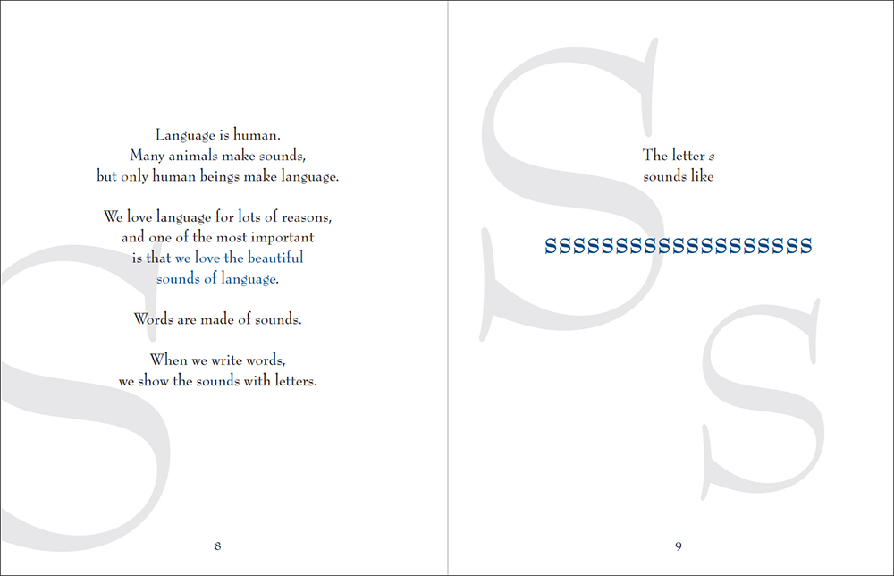
Michael tends to use a soft blue, as well as various shades of gray. These are calming colors, an influence to slow down students’ metabolisms, allowing them to respond to the written word and presented image. Michael avoids colors like orange that tend to raise metabolic levels and influence students toward a more frenzied response to stimuli. A calm student is a student who can take the time to learn, and this is the state in which Michael wants his readers. So many textbooks feature splashes of primary colors across the page as though that is where the student’s concentration should focus. The result is that they disrupt learning rather than enhance it.
Michael uses art, not cartoons or simple illustrations, to engage students. Art is more imaginative, more opening, more welcoming, more friendly. Art engages the imagination and encourages students to respond creatively. Cartoons and illustrations too often present a closed reality; there is no place for students to go once they have viewed the picture for a few seconds. It is not so with art. When Michael uses photographs (as in the poetics series), they are often open-ended photos that can take students to worlds where the imagination can roam. He is always looking to engage students at the level of Socratic questions, and repeatedly he employs art toward this end.
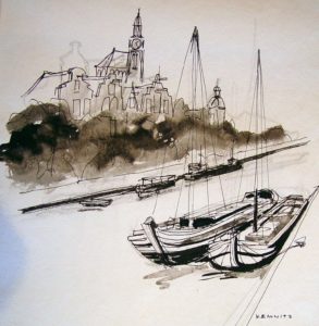
The art that Michael uses for the most part is by Milton N. Kemnitz (1911–2005), an American artist who began painting when he served aboard ship during World War II; he did hundreds of drawings and paintings of ships, ports, harbors, and maritime hardware. Michael uses many of these paintings and drawings in the Voyage Level. Kemnitz had a keen eye for buildings and urban landscapes, but he also owned an island in Georgian Bay, Canada, where he spent part of every summer painting until the last years of his life. The images in the Island Level and most of his wildlife art come from his time on the island.
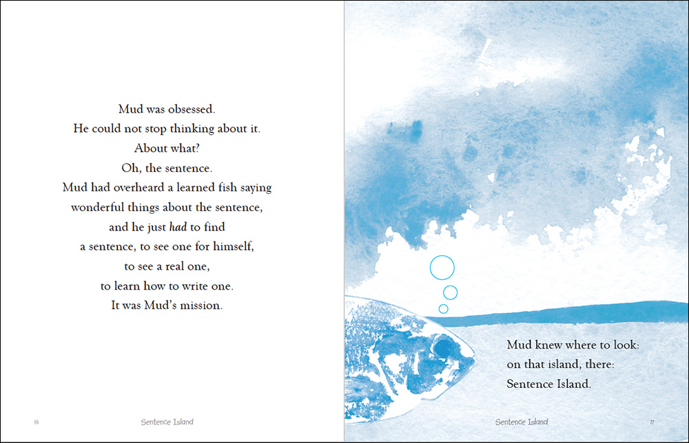
Sentence Island and Paragraph Town are the ultimate in the use of art to engage creativity and imagination in the service of learning some of the most basic concepts of writing. They are, fittingly enough, also the ultimate in the use of storytelling for the same purpose. Michael is able to go way beyond the concepts of more prosaic texts because he is engaging students at so many levels. He has used book design just as he has used storytelling in the service of pedagogy at a level so far beyond what we are used to that most adults miss what is transpiring.
So many students respond with enthusiasm! And teachers have something to say too:
“The images in Michael Clay Thompson’s books make all the difference. The art engages another part of students’ minds, catching their attention. This is especially important for students who can’t create pictures in their own heads. For my part, I can talk about the watercolor art and ask students to describe the picture, and they then can connect with the grammar.” – Mary Mowrey, middle school teacher, Lee County Schools, Sanford, NC
The proof is always in the learning, and with Michael Clay Thompson, the students learn and love it.